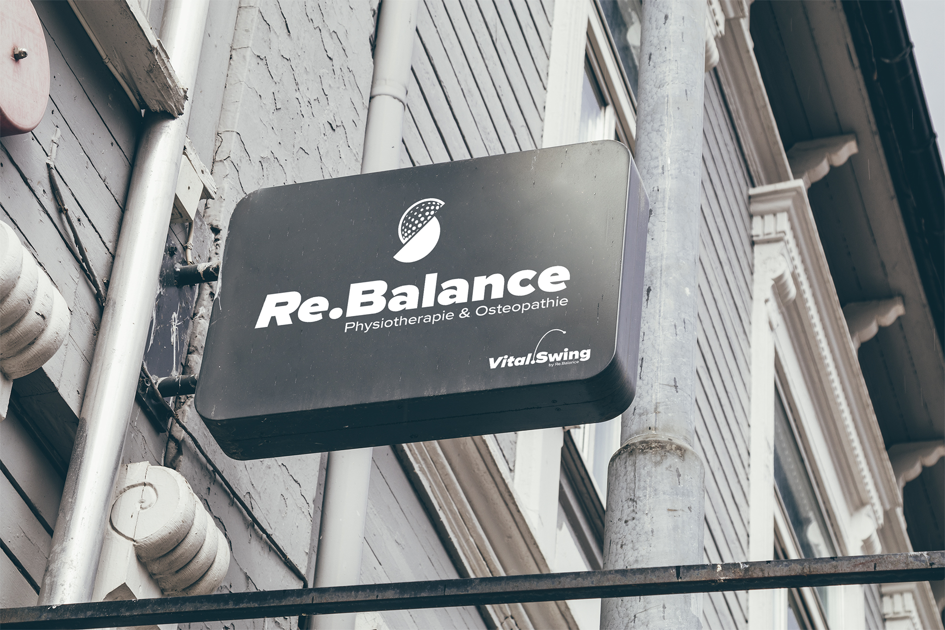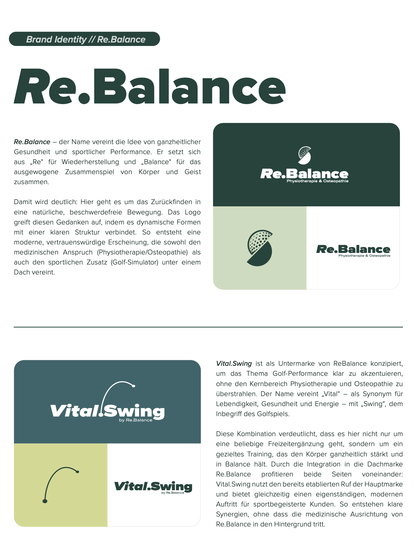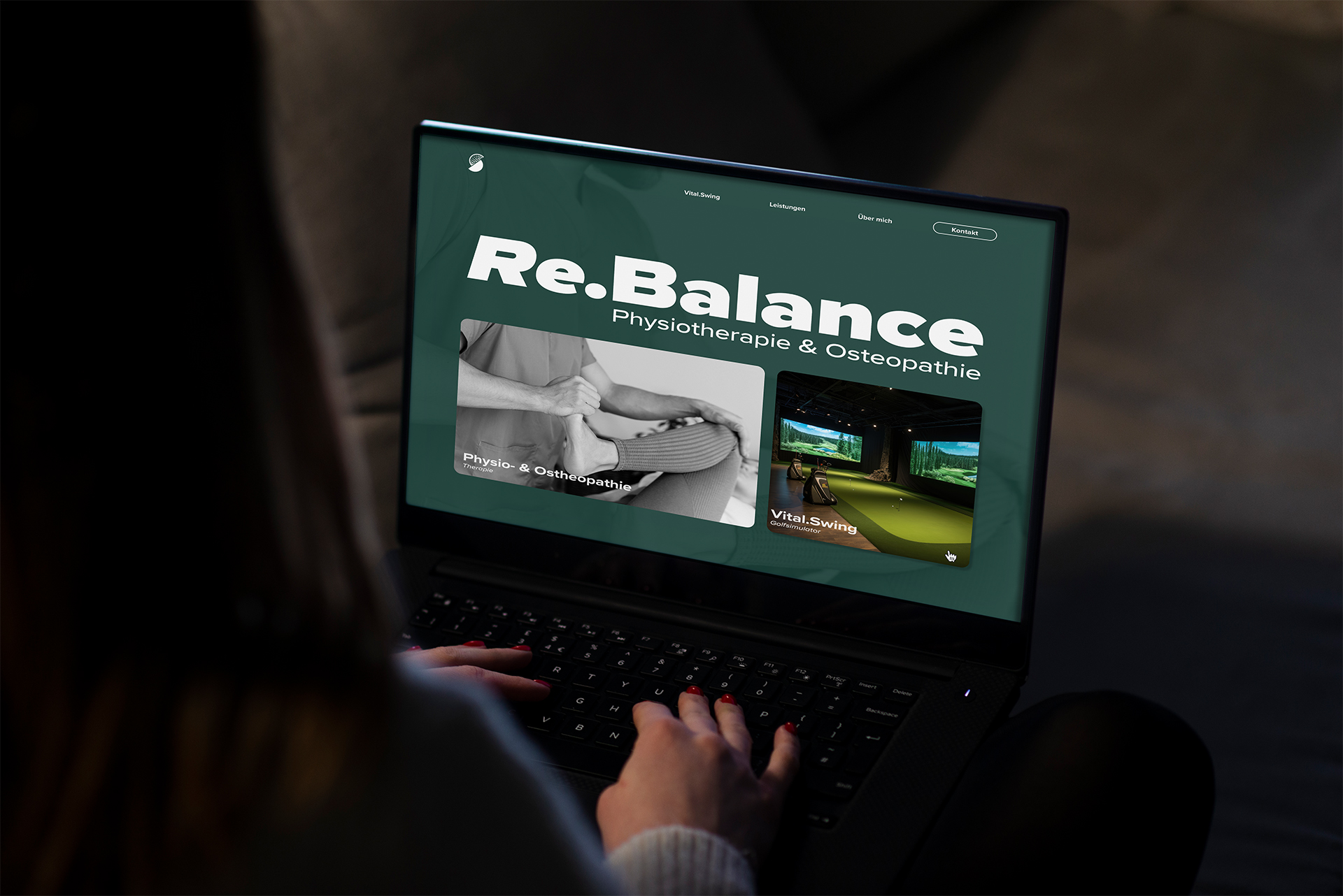
Re.Balance & Vital.Swing
The client’s challenge was to unite two distinct services – physiotherapy & osteopathy and a high-end golf simulator – under one brand. The task was to create a design system that clearly communicates medical professionalism while also highlighting sports performance and lifestyle.
I developed a dual-brand strategy:
- Re.Balance represents holistic health, recovery, and natural movement. Its identity combines clarity, trust, and modernity – reflecting the medical focus.
- Vital.Swing by Re.Balance was created as a sub-brand to accentuate golf performance without overshadowing the core physiotherapy practice. The name merges vitality, health, and energy with the essence of golf – the swing.
The logos were designed as siblings: similar in structure, typography, and form language, yet distinct enough to differentiate the two areas. This creates visual cohesion under the umbrella brand while giving each field its own identity.
The corporate design uses a calm, trustworthy color palette inspired by nature (greens, greys, off-white) to strike a balance between medical seriousness and sporting freshness. The website design reflects this system, guiding users seamlessly between physiotherapy and golf performance, while ensuring both services benefit from shared credibility and visibility.
This project demonstrates how careful branding and design can bridge different disciplines into one strong, recognizable identity.